LATIN WOK
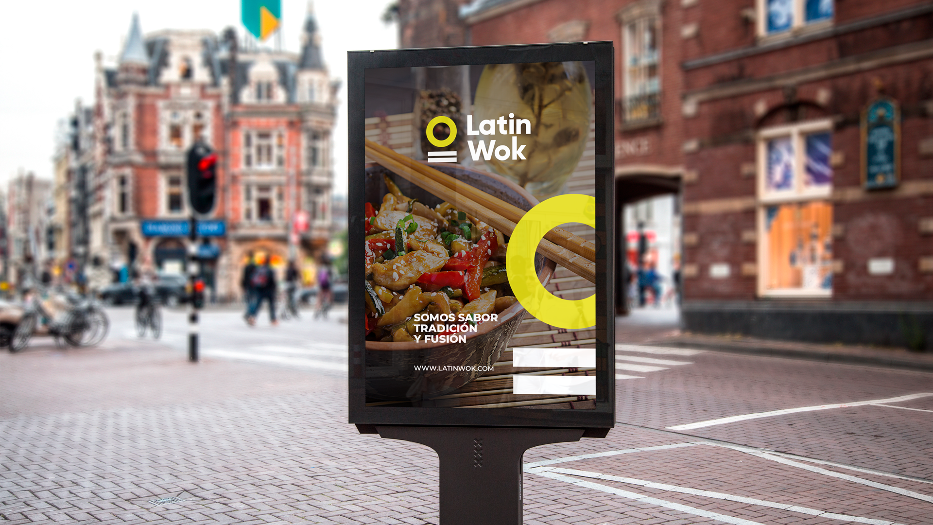
Latin Wok is a Chinese fusion restaurant in Santiago, Chile. The brief was to rebuild a brand identity that felt fresh, different and modern, starting from its heritage and from what they wanted out of the change.
Brand identity
LATIN WOK is a Chinese fusion restaurant based in Santiago, Chile.
Their mission: to give customers a unique dining experience, blending the highest-quality Chinese essences of oriental cooking with Latin flavours, and offering a wide range of dishes made to the highest standards.
Their vision: to be recognised as the first choice for Chinese food and to grow into a franchise and one of the fastest-growing companies nationally and internationally.
Brand — Latin Wok's goal was to rebuild a brand identity that was genuinely fresh, different and modern. Asian food is a pleasure for many people. We wanted an image that made the customer hungry just by looking at the logotype.
The first step was understanding their heritage and what they wanted from the rebrand. With their past and their wishes in mind, we started brainstorming words tied to the wok and to Asian restaurants. With the team we pushed ahead with the wok idea, and I started drawing.
Result
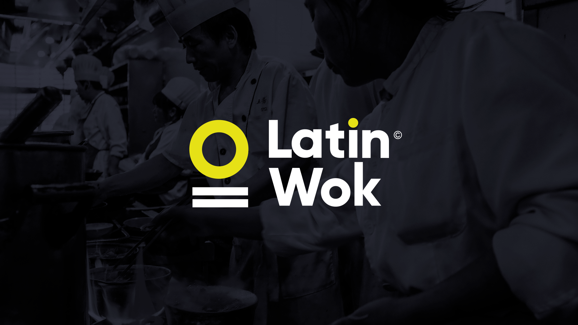
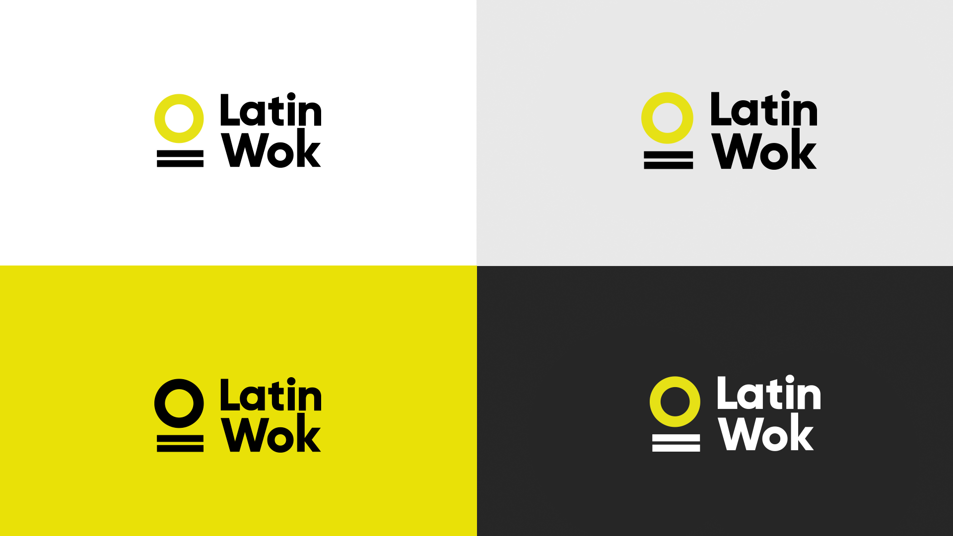
An imagotype: one of the ways a brand can be represented graphically.
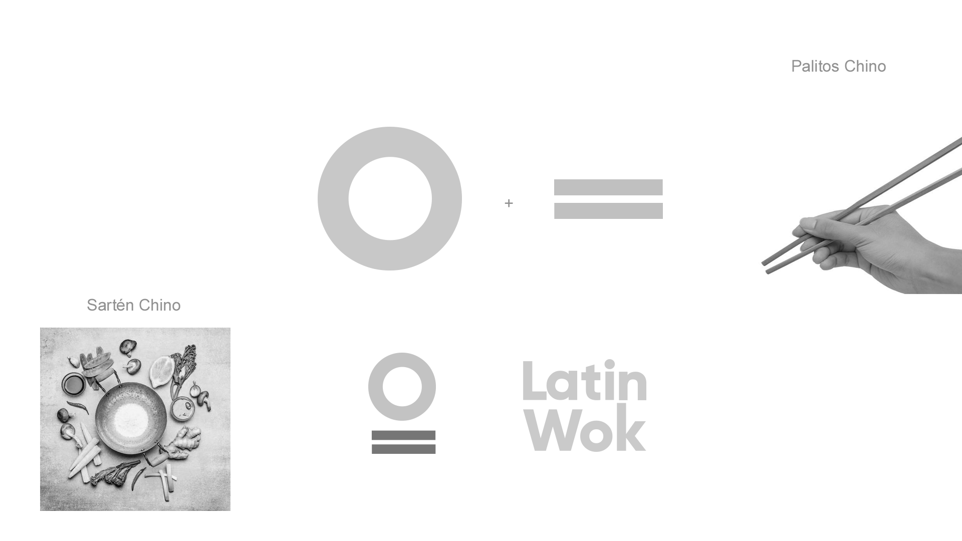
Here the icon and the brand name form a single element, a visual whole. Looking up the meaning of the word wok, we found it came from the name of a round, deep-bottomed pan — and from there came the circle of the imagotype, with two lines underneath as a differentiator, standing for one of the most important elements of Asian food: chopsticks.
Typography
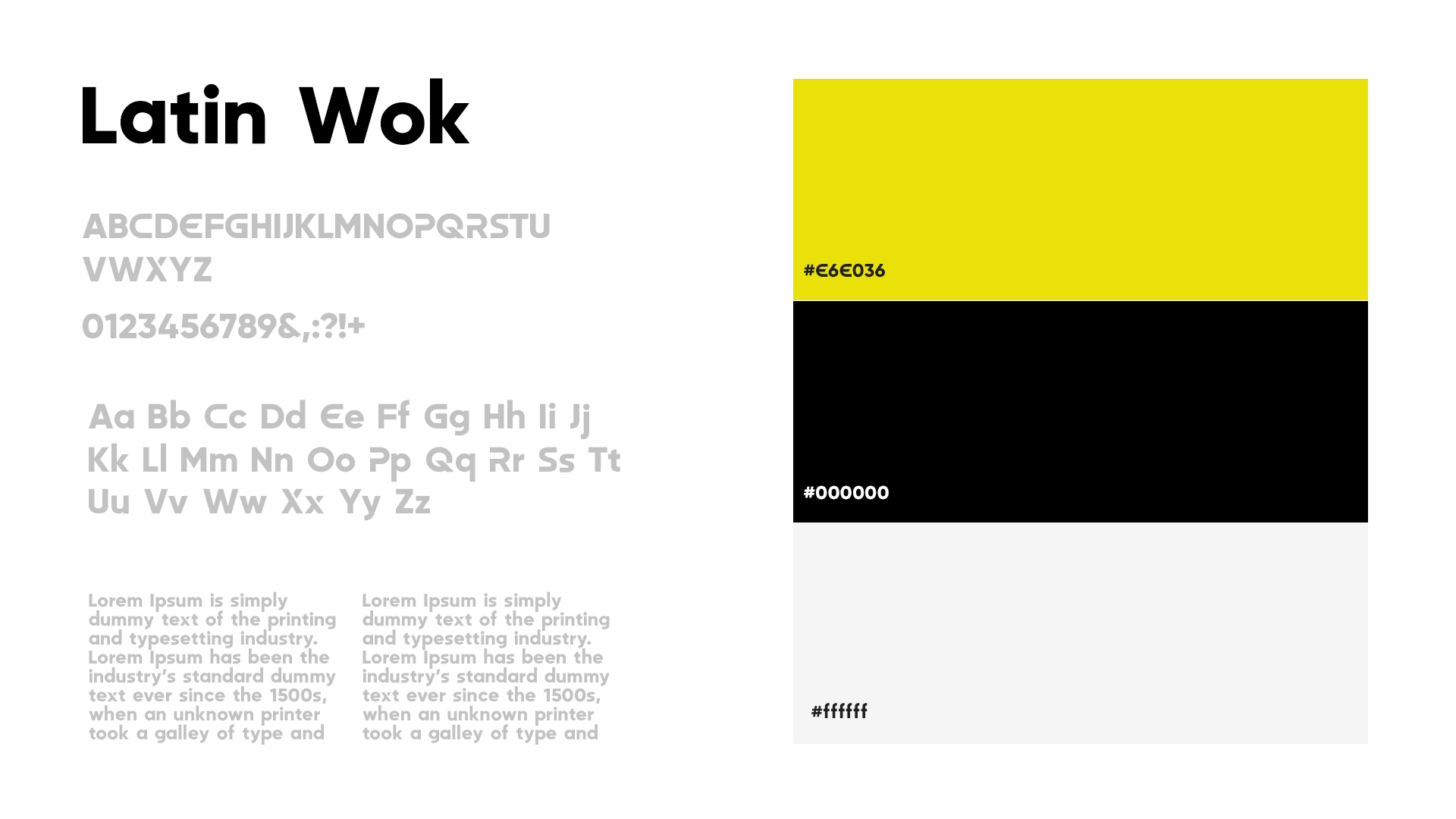
We used a sans serif called Maximize Bold: modern, elegant and striking. We set the Latin Wok name on two lines so it stayed visible and equally legible when scaled down.
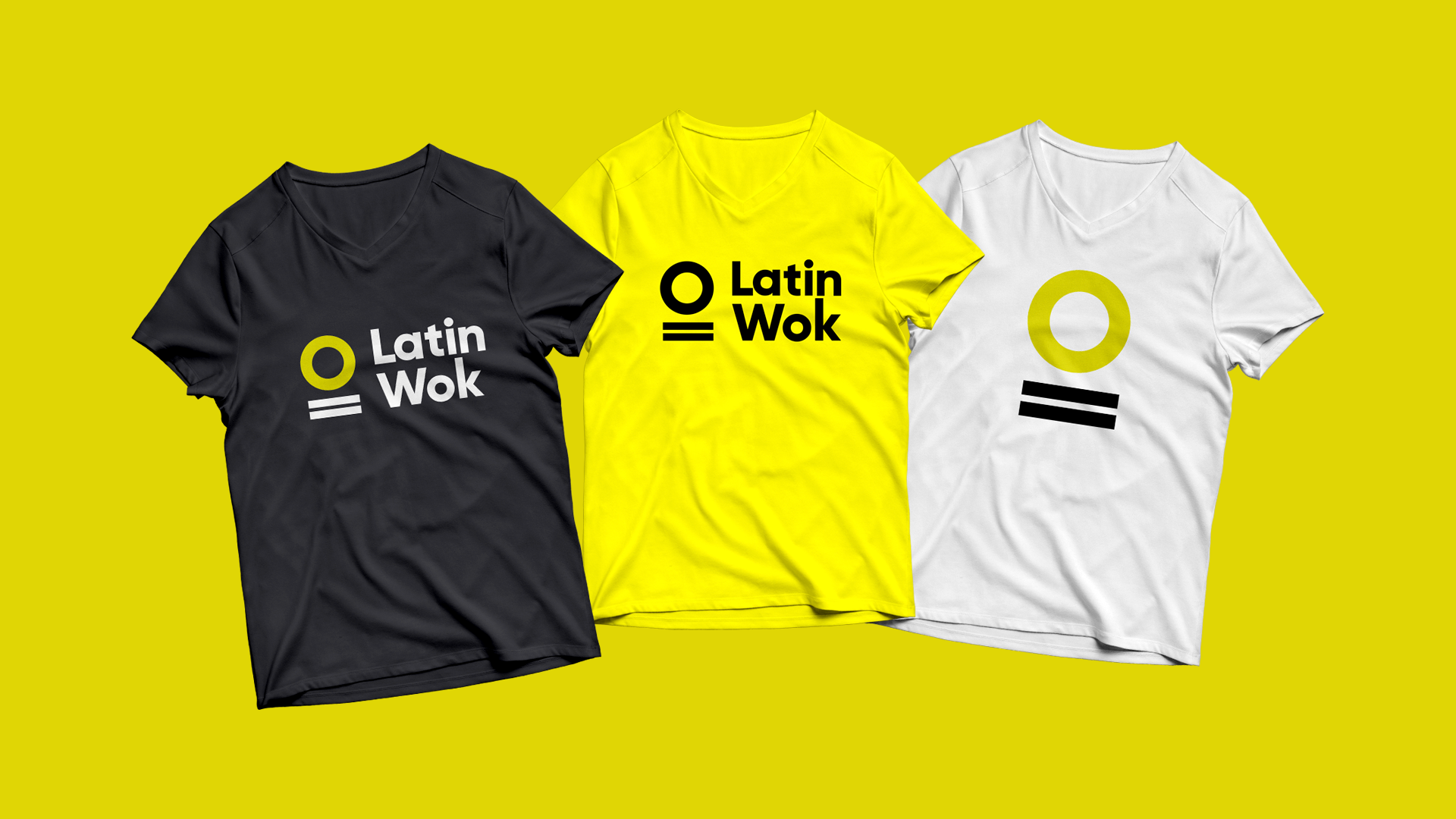
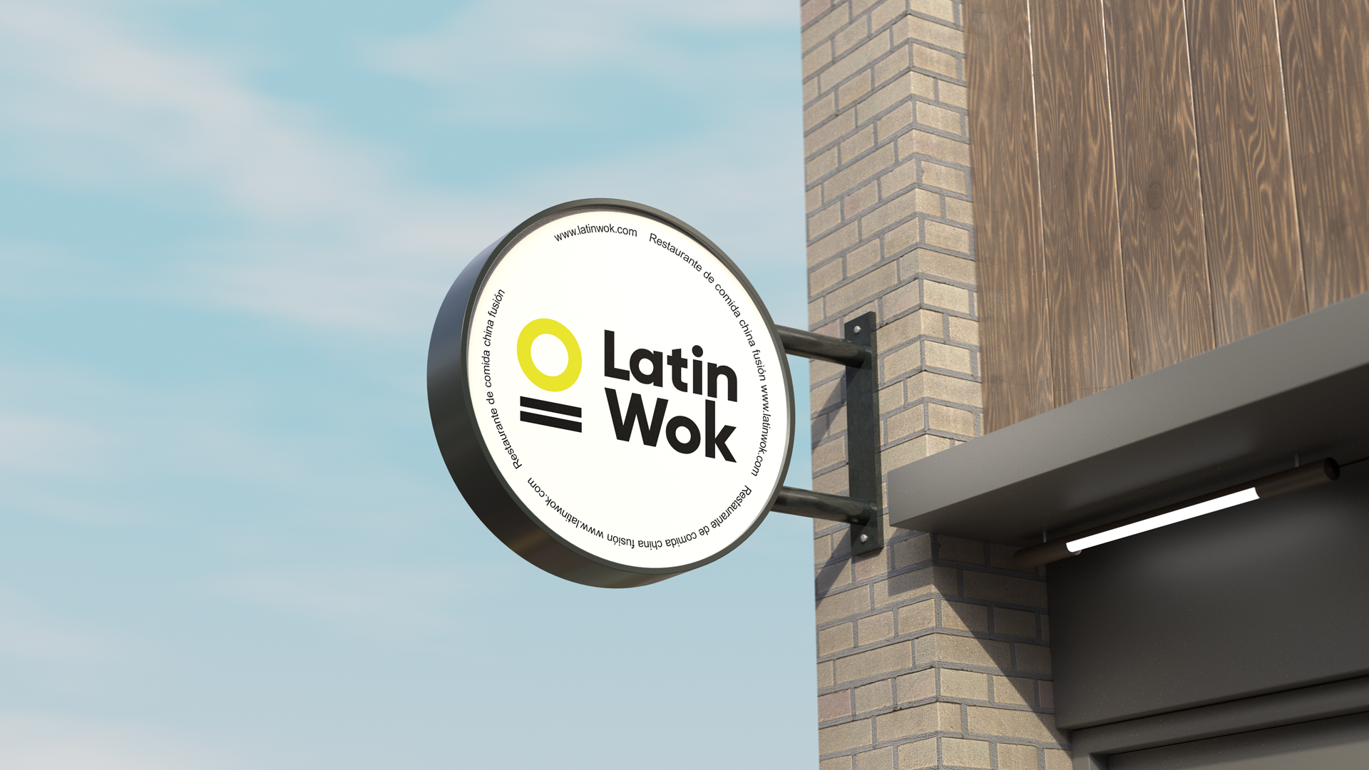
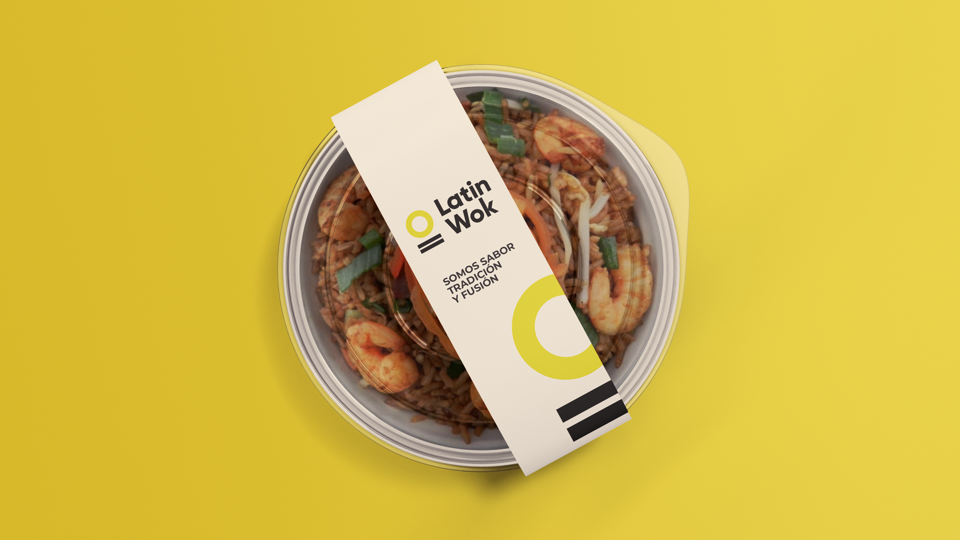
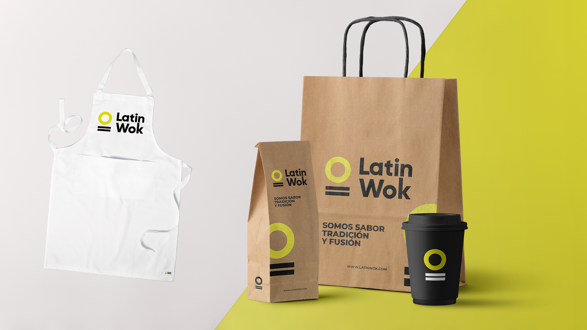
Applications — a few examples of how the brand would work as it rolls out.